📊 Results & Charts
This section highlights the key outcomes from the portfolio optimisation process — visual insights, performance summaries, and benchmark comparisons. All charts and tables are reproducible from the scripts in this repository.
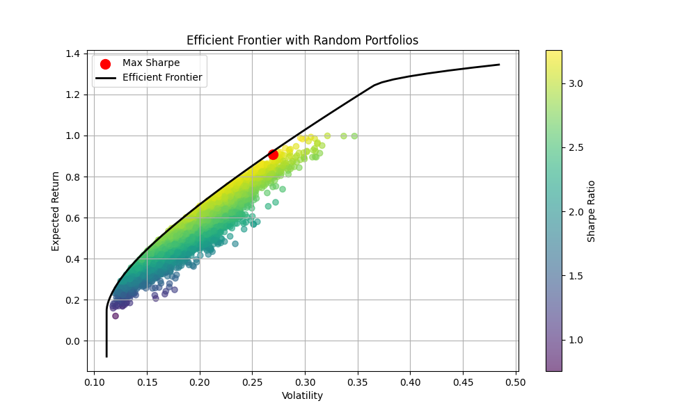
🧭 Efficient Frontier (Annual)
For each year, we generated 10,000 random portfolios and computed their expected return, volatility, and Sharpe ratio. The portfolio with the highest Sharpe ratio was selected as the optimal allocation.
📁 Output:
reports/efficient_frontier/efficient_frontier_<year>.png
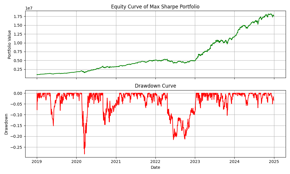
💹 Portfolio Equity Curve & Drawdown
This chart shows the portfolio value over time, along with its drawdown. It helps visualize periods of growth and decline, and identify the severity of losses.
📁 Output:
reports/equity_and_drawdown_plot.png
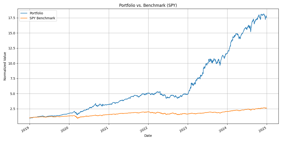
📉 Portfolio vs Benchmark (SPY)
A normalized comparison of the portfolio and SPY index since 2019. This chart shows how the strategy performed relative to the market benchmark.
📁 Output:
reports/equity_vs_benchmark_plot.png
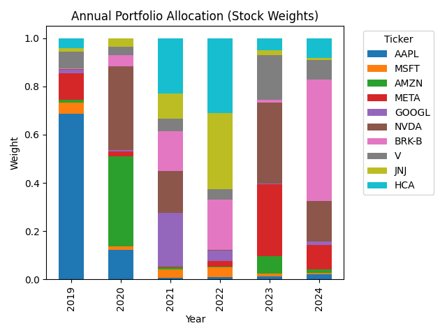
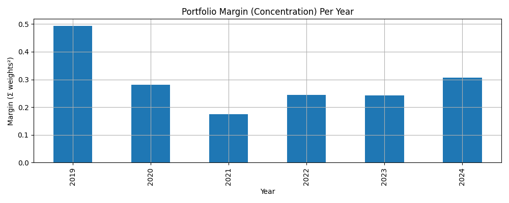
🧮 Portfolio Allocation & Margin
Two charts illustrate how the allocation to each stock changes yearly, and how concentrated the portfolio is (based on the Herfindahl index of squared weights).
📁 Outputs: -
reports/portfolio_allocation_per_year.png
-reports/portfolio_margin_per_year.png
📑 Summary Statistics
Exported CSV files contain summary statistics at the full portfolio level, per year, and for the SPY benchmark.
📁 Files: -
exports/full_backtest_summary.csv
-exports/annual_summary.csv
-exports/benchmark_summary.csv
-exports/annual_weights.csv
📥 Download full_backtest_summary.csv
📥 Download annual_summary.csv
📥 Download benchmark_summary.csv
📥 Download annual_weights.csv